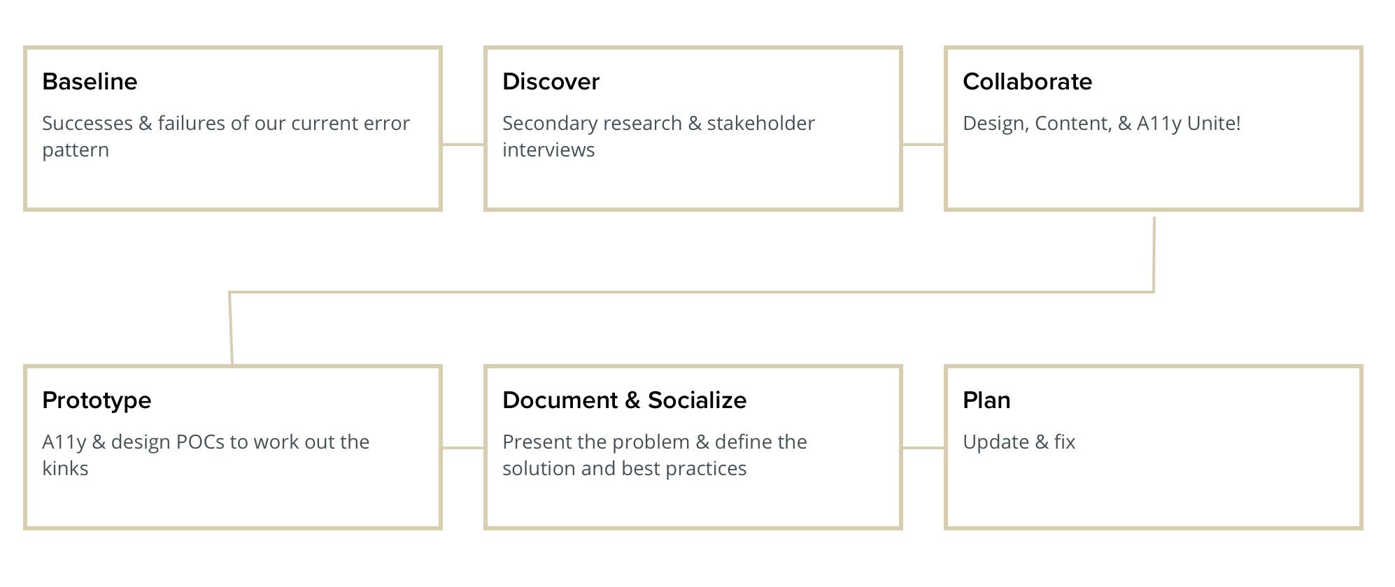
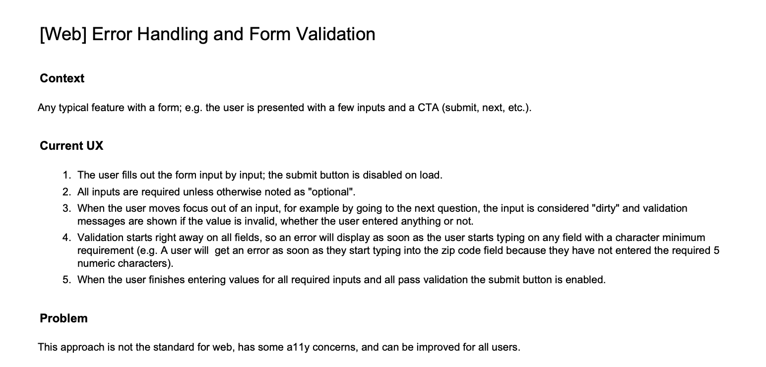
Design System UX | Accessible Form Validation

Key words & methodologies: UX • Research • Design systems • Accessibility • Accessible design
The Problem
The web forms error validation pattern on the Aetna member portal was taken directly from the companion native apps and was problematic for many reasons.
  • It didn't align with common web patterns and didn't follow form validation best practice.
  • It provided a poor input experience for our members that made it difficult to correct errors and omissions, especially people with accessibility (a11y) needs like low vision users or screenreader users.
  • It was the cause of existing a11y defects and would soon cause further defects on a new feature we were delivering unless it was fixed.
My Role | Lead Designer and Cat Herder
I pursued this project as an innovation project on top of my normal feature work. It took many months to gain alignment from the necessary stakeholders to change our form validation pattern across our web product, document and socialize the change across the wider Aetna design and dev teams, and set up a plan for engineering teams to pick up the resulting design debt.
______
Solution Overview
The new, accessible web form validation pattern not only improved a core experience for all of our users, but it also aligned the Aetna member portal with error handling best practices. In addition, it resolved numerous a11y defects across the product.

I helped to originate a design process in the absence of one, that of creating, socializing, and implementing a new UX pattern across the enterprise.
My final design POC, meant to be both demonstrative and instructive of the new pattern
______
The Process
The process to craft final design, content, and engineering recommendations for our form validation pattern took months. Aetna is a big organization with many stakeholders, and so along with the design part of the work, I was also herding cats (e.g. figuring out who all I had to pull in to make the new pattern successful).

I dive into each one of these steps in depth below.


Background
The Aetna Health Design Team expanded rapidly over my tenure at the company into four different feature portfolio teams. As is common, that rapid expansion brought with it major growing pains. Although we had a nascent design system in place, most new component and pattern decisioning would happen at the team and often feature level since we didn't any oversight to ensure consistency. As such, there was no established process for changing an existing pattern, socializing it across teams, or getting it implemented consistently across the product.

The status quo was design messiness, and on the rare and miraculous occasion, consistency.
Measuring the baseline
Tracking the successes and failures of our current error pattern
The first step was to capture our baseline - that is, document the UX of the current problematic pattern, along with any ways in which it was successful or failing. We had a couple things we were doing right, and a lot of things we were doing wrong.

Successes
✅ Displaying clearly written and easily findable in-line errors
✅ Using common design metaphors for errors (using icons, clear, consistent language, and color)

Failures
❌ Unclear which fields are mandatory, making it easy to skip a field and not know it
❌ Non-timely in-line errors — errors display as soon as the user starts typing before they've even had a chance to type a valid input, adding both visual and voiceover interruption
❌ Screenreader navigation issues - no easy way to pinpoint form problems or navigate between problematic fields
❌ High call rate, especially for longer forms
Discover
Conducting secondary research and stakeholder interviews
Secondary Research
Secondary research consisted of digging into much of the design system and UX thinking online for forms and how best to validate them in an accessible way. I also conducted a competitive audit on number of forms to note the good and the bad out there.

❌ Avoid confusing or overly noisy validation


Screenshot of a form for a credit card, showing combined helper and error text next to the field.

✅ Aim for clear, timely validation with specific error language to help the user fix any issues. Allow the user to get feedback on all fields, including empty, required ones.


Stakeholder Interviews
I interviewed key design, engineering, architecture, and accessibility specialist stakeholders about the ideal experience and what it would take to make this change across all design and engineering teams at Aetna. Luckily, the stakeholders' goals for validation aligned with the insights from secondary research.

A11y offered a novel perspective when it came to pain points with the pattern as it existed:

Low-sighted and screenreader users could easily get stuck in our payment form.
Screenshot of the Aetna payment form. The button says "Review payment", but is disabled and not clickable.


The current pattern seemed to keep how to move on a secret – it kept the CTA disabled until all fields were filled in, and there was no way to get feedback on which fields were empty or invalid if you had accidentally skipped a field. This can happen easily with a low-sighted user who is zoomed in and not seeing most of the fields at a glance, and even easier for a screenreader user when our navigation and labeling was not ideal.


✅ If errors occur, summarize issues with the form and clarify the page status.
If we could provide a summary of issues or a current status of the page, that would allow screenreader users to more easily navigate even the longest forms.


Avoid overly aggressive validation


A screenshot of a zip code form field. The user has only typed in 1 number so far, but the field is showing an error with the message, "Zip code must be 5 digits"


The lack of timely validation in our current pattern was frustrating and felt overly aggressive, especially to screenreader users who would be interrupted by the error before their input even had a chance to be valid.

Additionally, new WCAG guidelines around alerting the user to the current status of the page had been released that would mark this as an additional defect and decrease our a11y score.

In talking with our Design Operations team, we wanted to pilot a new process to update an existing design patterns. We decided to use this design system governance process from Brad Frost as a model to follow with this form validation pattern being the pilot. You can see Frost's model here.


Collaborate
With our design, a11y, and content powers combined...
Now to the fun part! How could I go about taking all these inputs and making something better?

Through a process of collaborative concepting with a11y, engineer, and content partners, we decided to make a few changes:


  • Provide a form overview to set expectations of the task to come, communicating things like which fields were mandatory on the form.
  • Enable the CTA on the page by default to allow the user to easily get feedback on outstanding issues at any time.
  • Provide a summary of errors upon submission, along with a way to easily navigate down the page to them for all users, whether by mouse, keyboard, or screenreader. Keep users in mind for whom animation is jarring or would lead to confusion when dictating the visual treatment of this navigation and page jumping.
  • Lay out design and engineering guidance for making validation much more timely and less unnecessarily interruptive.
  • Provide engineering guidance to allow for a natural and informative screenreader experience with form errors.


The A11y team was vital to this effort – without their expertise and collaboration, we could have ended up with a sleek new pattern that was still causing a11y defects.

In addition, my content partner helped to provide guidelines for the net new content aspects of the pattern. This included the form overview that would set out expectations of what was to come at the top of the form, content guidelines for empty form field errors (which didn't exist with the previous pattern), and content for the alert banner that would summarize all errors at the top of the page.
Prototype
Create design and dev POCs to work out the kinks
Dev POC
The A11y engineers created a simple web POC to demonstrate how the error banner at the top of the page would function with a screenreader. In addition, the POC helped them figure out how a user should navigate from the banner back through the form to correct their errors.

I served as a consultant to these efforts and integrated their learnings back into the documentation and design POC.
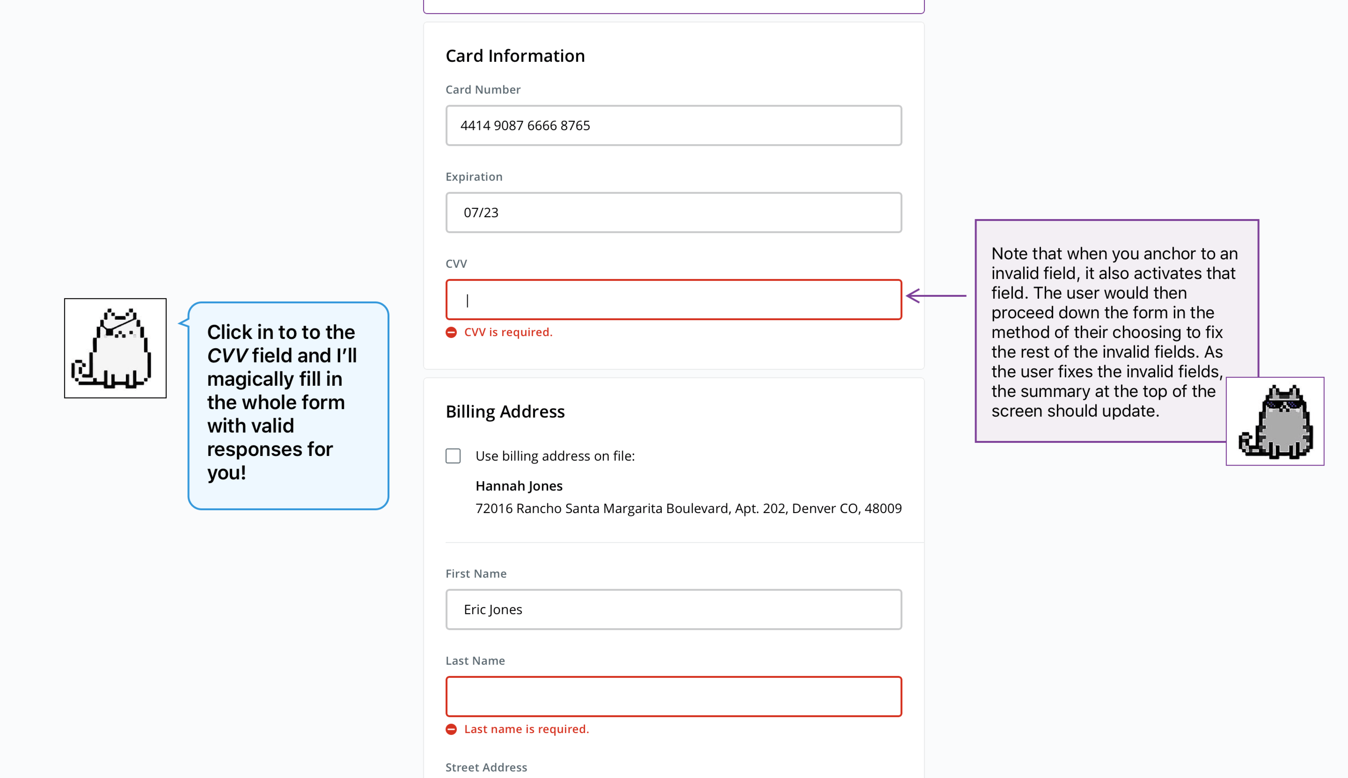
Design POC
I prototyped a simple design POC to able to demo and review the new pattern. It was meant to be both demonstrative and instructive for devs and other designers, showing the new pattern and then highlighting useful details of the new UX. I borrowed the A11y Cats, a creation of the folks at A11yTalks and a favorite of our A11y team, for the prototype's more instructive bits.

Some highlights from the POC are below. You can also click through the POC here.
Document & Socialize
sub here
I worked with a front-end architect to write up the first draft of documentation for the new pattern to assure it was both designer- and developer-friendly easy reading. From that very first draft, I started socializing it, along with the instructive POC across the team and stakeholders.

The documentation went through many revisions and additions through collaboration sessions and reviews with stakeholders. You can read the form field validation documentation here or by clicking the preview below.

Preview image of the aforementioned form field validation documentation.
Plan and execute
Update the pattern across the product; feel the joy of design consistency
Along with my partners in Design Ops, we came up with a plan to socialize the new form validation pattern across the design and engineering teams and to plan for each engineering team to complete any resulting design debt. I worked with a "sponsor" from each design team that had a form in their part of the application to help them learn the ins and outs of the new pattern so they could then help with the design debt cleanup on their team. We also pulled in product to get the work prioritized for each team, solving multiple a11y defects in the process.

In the time after I completed this project, Aetna was acquired by CVS. I became something of a design "error handling SME" and participated in a cross-organization group to create consistency in error handling across all portfolios. Our end deliverable was a set of recommendations and guidance to our new Enterprise Design System team.